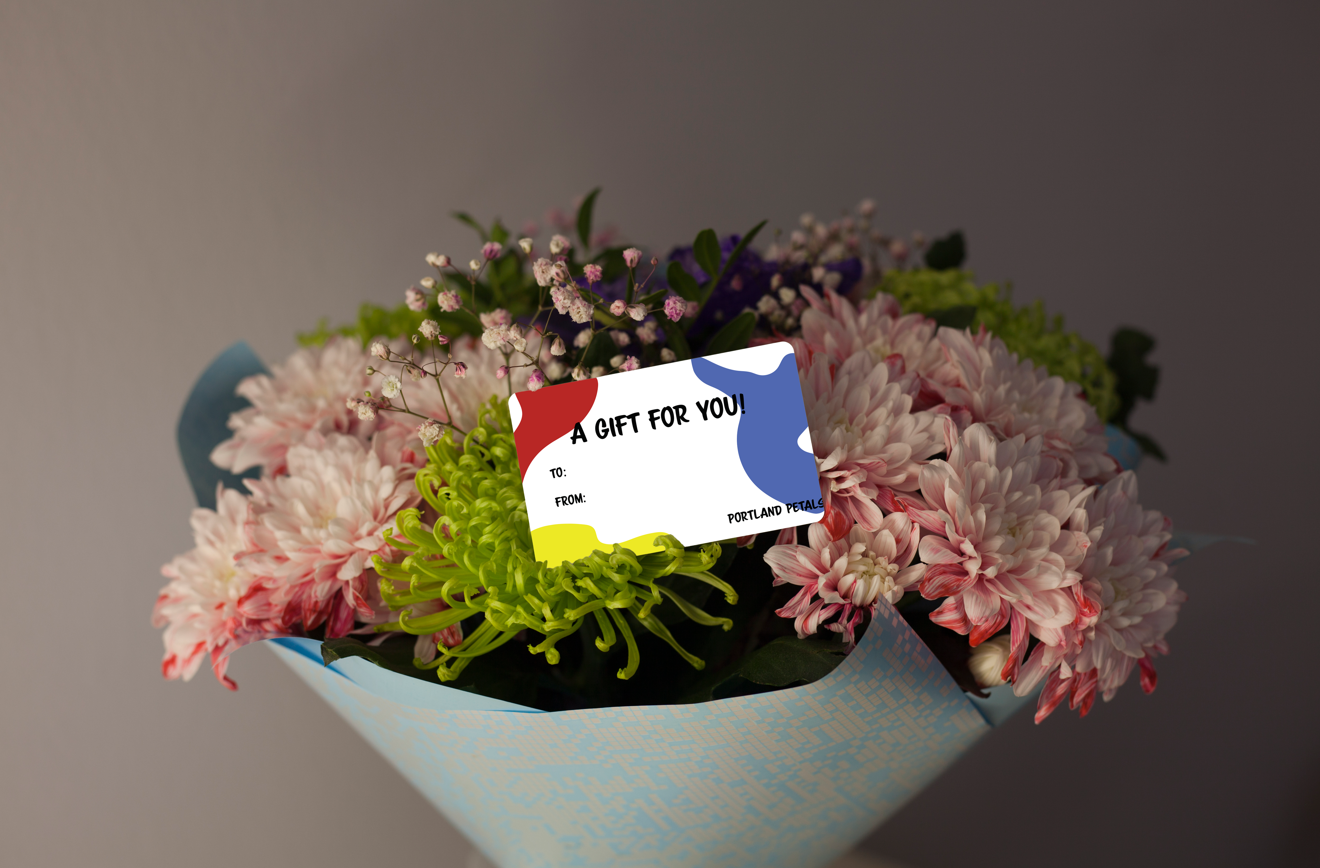
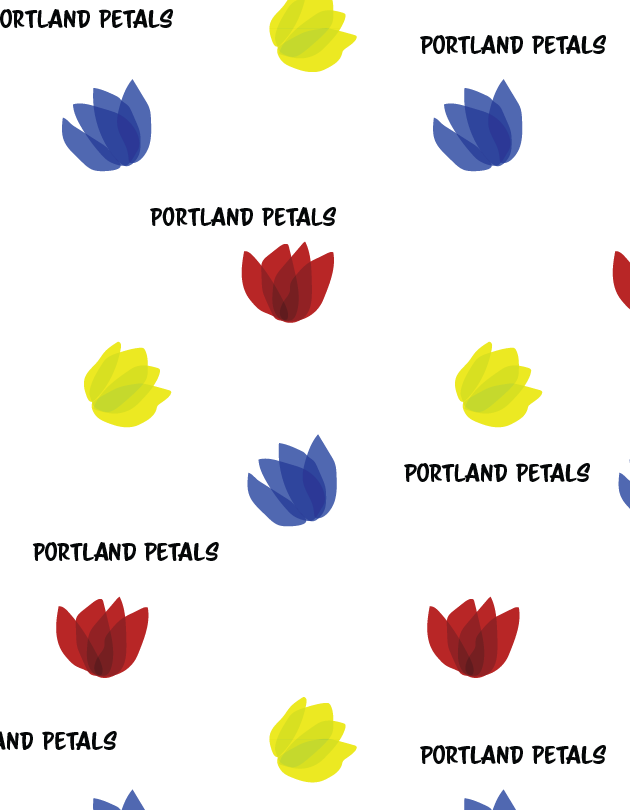
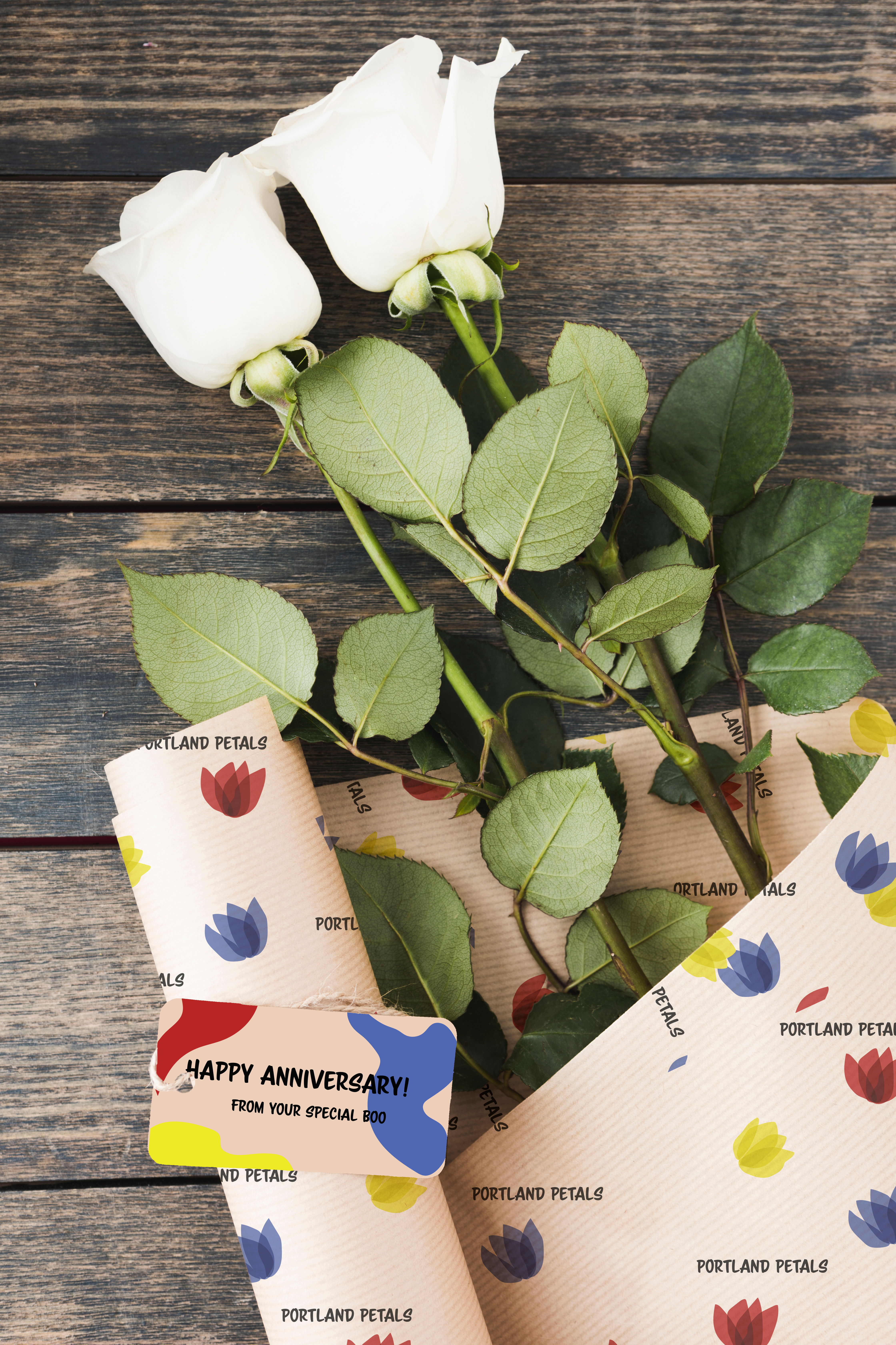
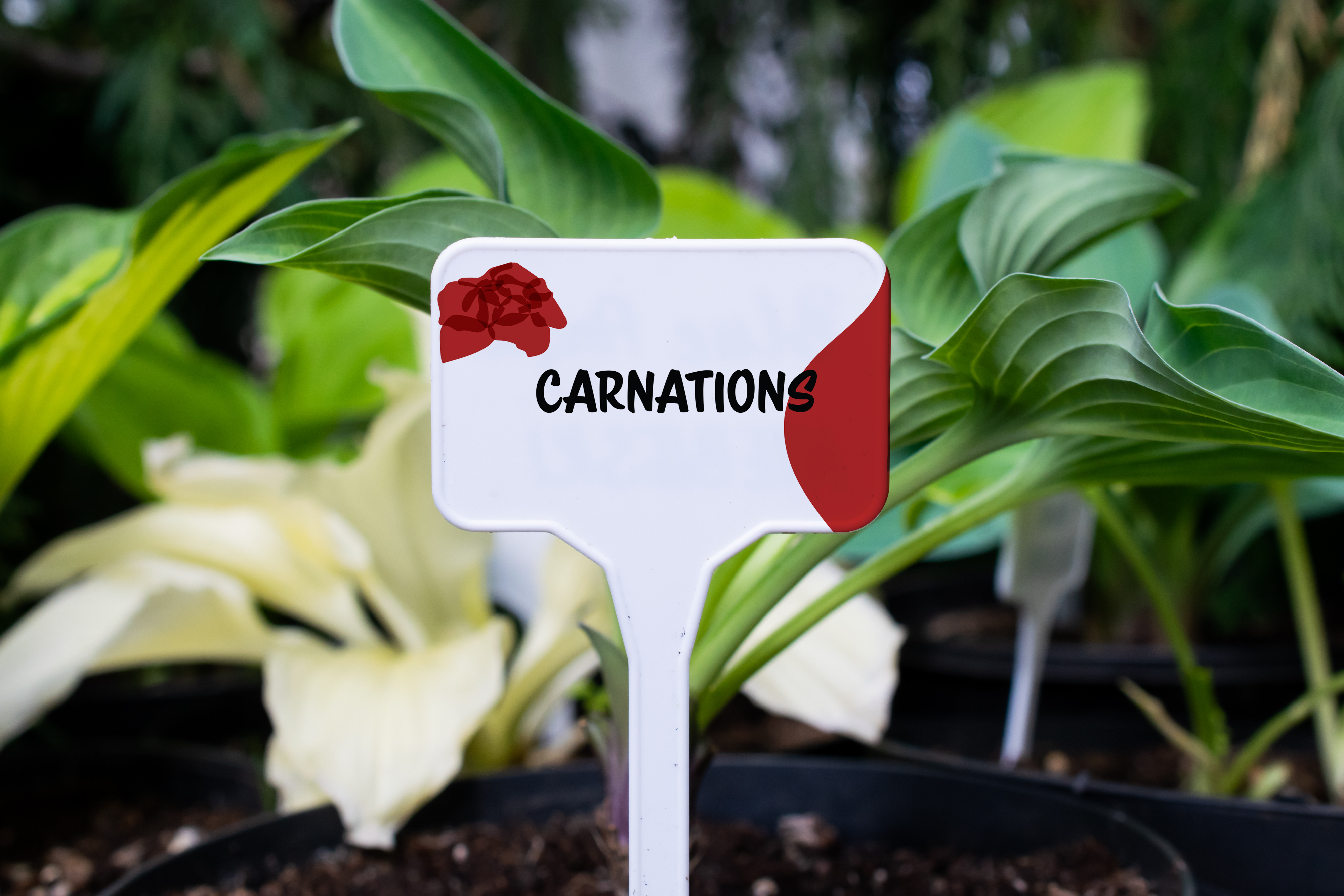
Portland Petals is a flower shop based in Portland, Oregon. They wanted their branding to be fresh and different, not following the simple scripty pastel colored theme that flower shops usually have. Primary colors have been chosen to represent the color scheme of this flower shop because every color out there can be created from the primary colors. Flowers are many different shades, shapes, and colors, and Portland Petals wanted to use flowing, orangic shapes to represent that.


Selected Works

Senior Photos - KateSenior Photos
Team BottlesWraps and Decal Graphics

Adamson Outdoor SolutionsCompany Logo

Midco Vehicle WrapsCar Wraps

Equipment WrapsHeavy Equipment Wraps

Senior Photos - IsaacSenior Photos

NorthwicksFamily Photography

StahlmannsFamily Photography

Nick & AnnaCouples Photography

Erin & ZachCouples Photography

JP & SabrinaCouples Photography

Marley & AndrewCouples Photography
Scenic PhotographyScenic Photography

Product PhotographyProduct/Studio Photography

The Athletic CollectionAthletic Player Posters
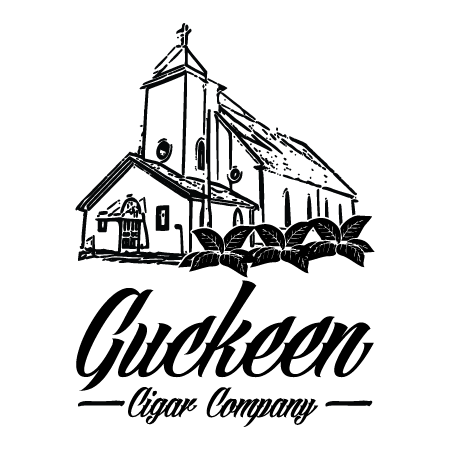
Guckeen Cigar CompanyCompany Logo

Car Decals - Military BaseCar/Window Decals
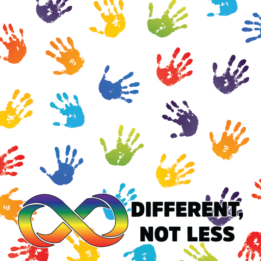
Autism AwarenessNon-Profit Branding
Puzzles Bar and GrillRestaurant Branding
Tailgates Bar & GrillRestaurant Branding
All About Murders: A Detailed Look at CrowsPodcast Rebranding

UMD Athletic GraphicsSocial Media Graphics
Book Covers - TrilogyBook Cover Series
Portland PetalsCompany Branding
G.C. GiantsUX Design
Chinese New Year 2023Event Promotion
Flora FusionAugmented Reality
Night CookiesCafe Branding

IllustrationsIllustrations

Cards For OccasionsStationary Design, Cards

Handmade SketchesOn Paper Artwork